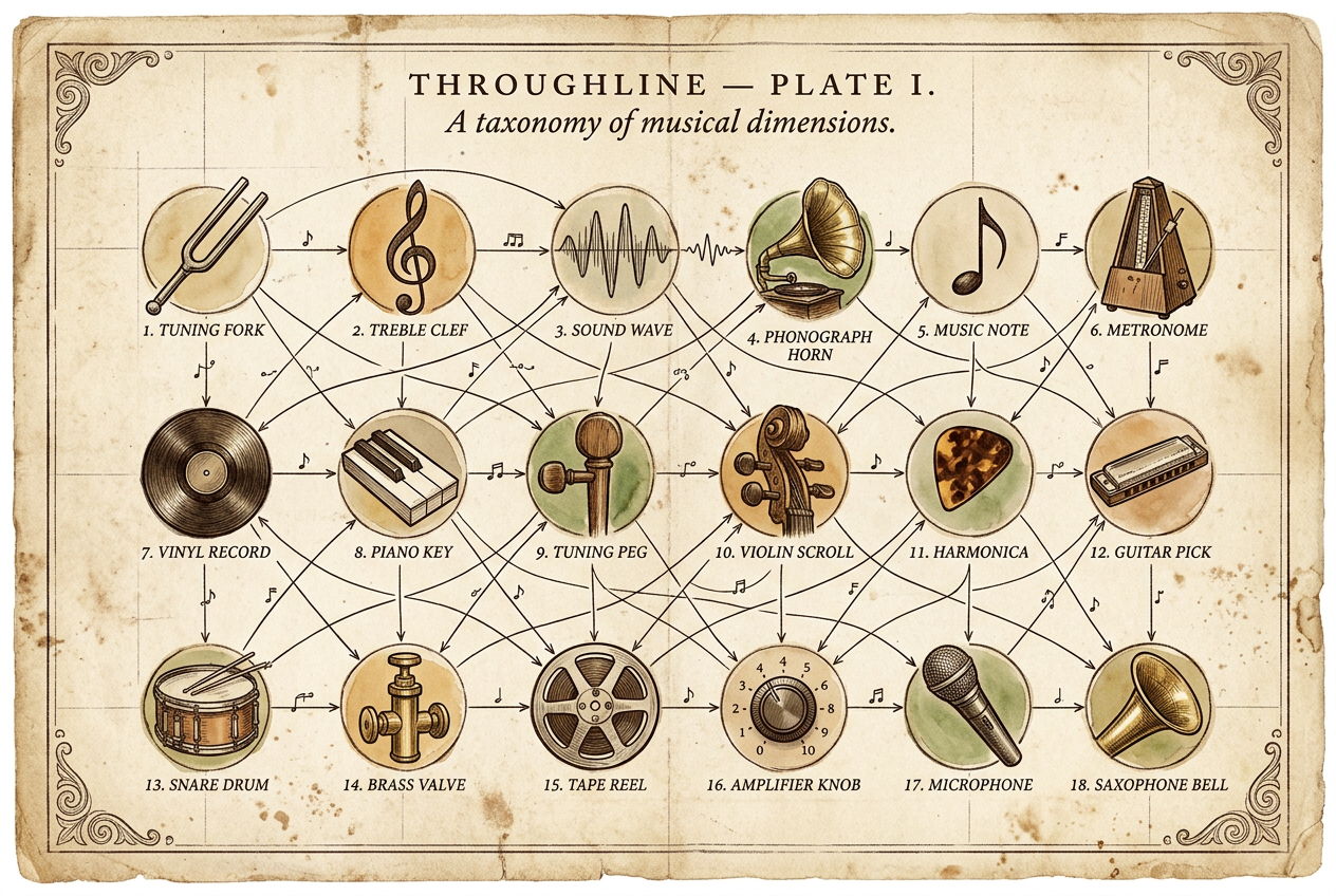
Throughline
A song-level music graph that plays you the annotated path between any two songs — every hop explained
- Class
- Music Recommendation Graph
- Habitat
- throughline.giffen.me
- First observed
- 2026
- Platform
- music · graph-db · neo4j · recommendation-engine · audio-analysis · llm · data-visualization
- In the wild
- throughline.giffen.me ↗
The Problem
I fell for Royel Otis’s Car — a woozy jangle-pop song with shimmering guitars and a melodic bassline that sounds beamed in from 1986. I wanted more. So I asked Spotify. It gave me more Royel Otis, then a grab bag of Australian indie bands that shared a genre tag but not a sound. Nothing that actually sounded like Car. Nothing that could tell me why it should.
Every recommendation engine treats artists as atomic units. One genre tag, one cluster, one set of recommendations. But three Royel Otis songs point at three different musical traditions: Car channels The Smiths, Moody channels Beck, Oysters in My Pocket channels The Jam. Three songs, zero fingerprint overlap, one tag. Collapsing all of that into “indie pop” throws away the most interesting information there is.
Throughline models music at the song level instead. Every connection between two songs has a reason you can read.
What It Is
A graph. Nodes are songs (plus their artists, producers, and labels); edges are SOUNDS_LIKE relationships, each carrying a dimension and a prose explanation. Every song is fingerprinted across 18 musical dimensions — not genre or mood, but specific things like snare character, bass role, hi-hat work, vocal style, nostalgic quality, and whether the artist’s own voice survives the production.
Songs connect through shared dimensions, and every edge tells you which one and why: “Both channel Johnny Marr’s arpeggiated jangle, but at different tempos.” When the graph says Car sounds like Alvvays’s Dreams Tonite, it can name the throughline — shimmering guitar tone, dreamy vocals, woozy-reverb atmosphere, bright-sadness register, a melodic-walking bassline.
That’s the whole thesis. Spotify tells you what to listen to. Throughline tells you why.
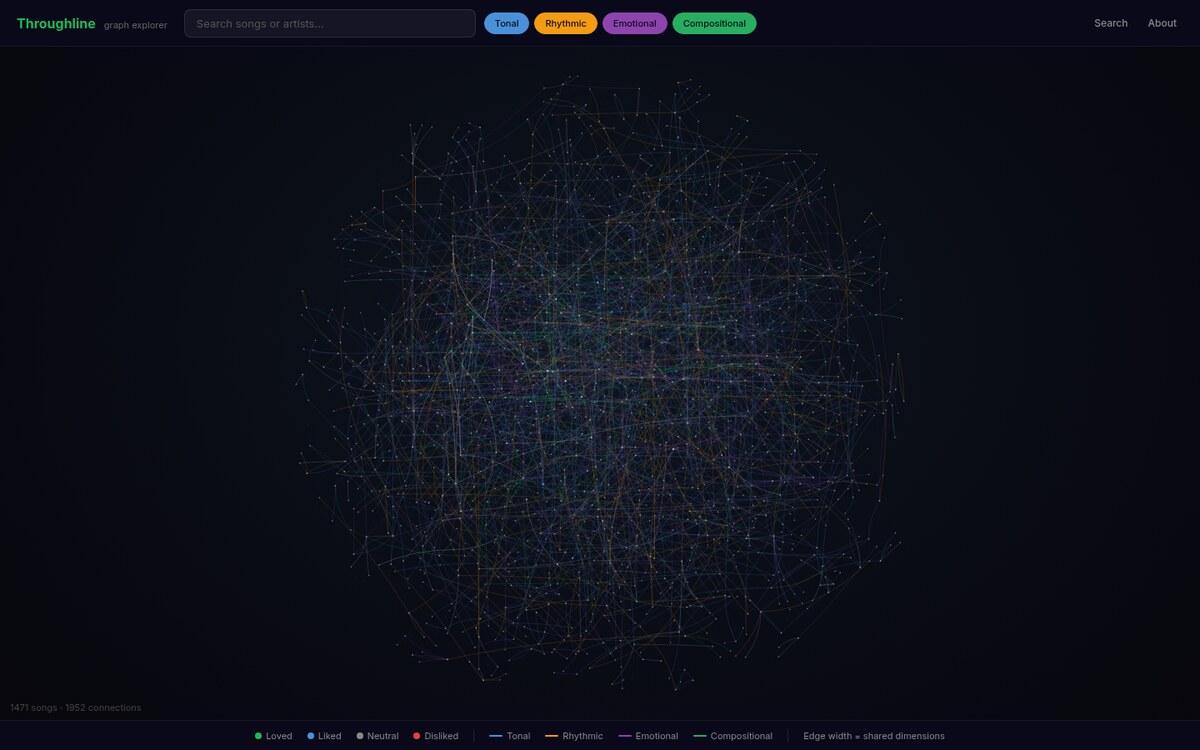
Today the graph holds 1,471 songs across 254 artists, joined by ~1,950 annotated song-to-song edges over those 18 dimensions — and it’s a single connected component, so any song can reach any other.
The Fingerprint
Each song runs through a four-stage pipeline before it ever enters the graph:
- Source.
yt-dlppulls the audio. - Separate. Demucs splits it into four isolated stems — drums, bass, vocals, and everything else.
- Measure.
librosaextracts quantitative features from each stem: tempo, onset density, spectral shape, timing feel. - Judge. Those numbers go to Claude Sonnet along with the full dimension guide — descriptions, allowed values, reference songs, and listening hints — and it assigns the 18 dimension values.
The last stage is the point. It isn’t a classifier picking from buckets; it’s a music critic reasoning about what makes a song distinct, grounded by the numbers but drawing on knowledge of the artist and the era. Every value is calibrated against a reference song — “bright-sadness” is anchored to Just Like Heaven, “brushes” (snare character) to Andy Shauf’s Begin Again — so the vocabulary stays consistent across 1,400+ songs instead of drifting.
Under the hood the dimensions are reified: instead of flat properties on song nodes, each value is its own DimensionValue node that many songs point at. That turns “songs like X” into a cheap graph traversal — walk to X’s dimension values, walk back out to everything else that shares them — and it means a new song joins the neighborhood the moment it’s fingerprinted, with no recomputation. Candidates are scored by IDF: a rare shared value (a specific fingerpicked bass tone) counts for far more than a common one (mid-tempo).
Every edge also carries a prose annotation — written by an LLM from the two songs’ fingerprints and its own music-critical knowledge, then reviewed. (An earlier version of this page called these “hand-authored.” They aren’t, and saying so undersells the actual interesting part: the annotations are generated at graph scale and stay in one voice because one model with one rubric writes all of them.)
The Analyzer, Twice
The first analyzer was rule-based — thresholds bucketing librosa numbers into dimension values. It was fast, deterministic, and useless. Threshold-bucketing collapsed the vocabulary to two-to-five values per dimension across the entire catalog. Every mid-tempo song got the same “groove type.” The fingerprints all looked alike, which is the exact failure I was trying to escape.
So I deleted it wholesale and replaced the whole cascade with a single LLM call carrying the full dimension guide, one instruction doing most of the work — abstain rather than default to the center — and a per-dimension rationale stored for debugging. The validation case was two Royel Otis songs I love and hate respectively: the new analyzer differentiated 13 of 18 dimensions between them and populated all 18 with defensible, music-aware values. The rule engine never came back.
The lesson generalized: the downstream graph code stays completely agnostic to how a dimension got its value. Retuning the analyzer means changing a prompt, never touching the recommender.
The Reframe: From Search Box to Bridge Machine
Here’s the honest part. For a long time Throughline had a search box on its homepage, and it wasn’t taking off.
The moment you put a search box in front of music, everyone’s first move is to type their favorite song. My catalog is ~1,500 songs of one person’s taste. So the very first interaction failed almost every time — and the app apologized for it with a small empty-state about the modest catalog. I’d built a demo whose opening move was a head-to-head with Spotify’s hundred-million-track search, and I was losing it in five seconds.
Meanwhile the one thing the project could do that Spotify structurally cannot — build the annotated, playable path between two songs — was buried as a single search chip.
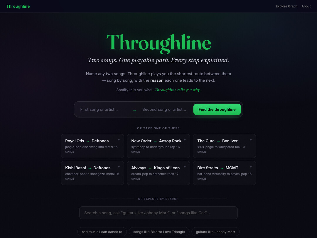
So I flipped it. The homepage is now a bridge machine: name two songs, and Throughline plays you the shortest route between them as a cinematic, auto-advancing journey. Each song holds the stage for a beat, the reason it connects to the next one animates in, and it drifts onward. Car → Just Like Heaven → Here’s Where the Story Ends → Alison → Digital Bath → Change — jangle-pop dissolving into Deftones across five hops, and every hop tells you why. Search still exists; it’s just demoted to the deep-dive mode it always should have been.
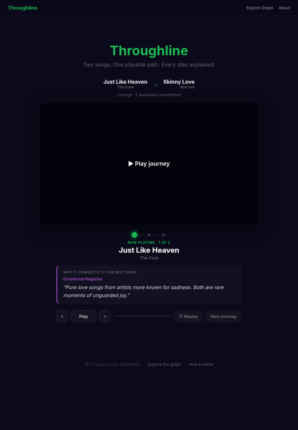
The timing engine is deliberately decoupled from the audio: a hop advances on its own clock, so a missing track or a browser that blocks autoplay never stalls a live walkthrough — there’s a one-click start as the fallback. It’s the difference between a demo that always runs and a demo that runs if the network cooperates.
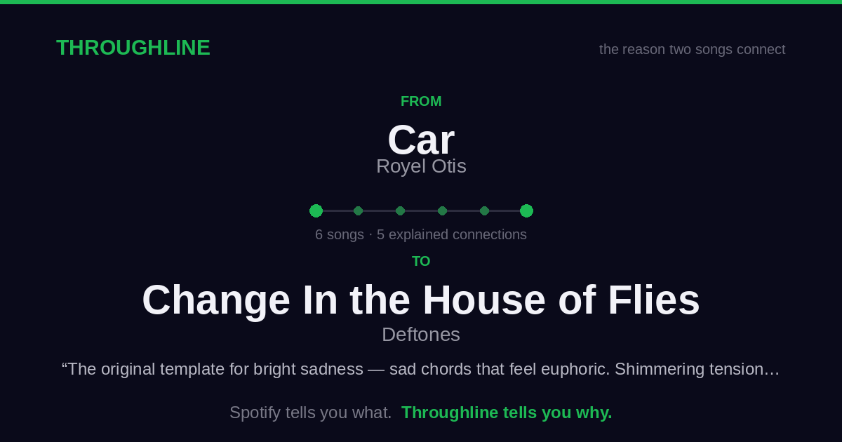
The last piece was making journeys leave the tab. Each one gets a permalink — /j/{from}/{to} — that boots straight into the theater, and, because link unfurlers don’t run JavaScript, a server route renders the Open Graph tags and a 1200×630 preview card (drawn with Pillow, no headless browser, so it renders anywhere the app runs). Paste a journey into Slack or iMessage and it unfurls into a card: the two endpoints, the hop count, the first reason, the tagline. A journey you make is now a link you can send.
The whole surface got a visual identity to match the idea, too — a dark, editorial look with a display serif and an atmospheric field behind the composer. And the deep-dive mode renders the full graph as a browsable constellation, where the same-artist scaffolding is faded to threads and the dimension-coloured similarity edges become the structure you actually see.
What I Built
The graph and pipeline
- 1,471 songs / 254 artists / ~1,950 annotated edges, one connected component
- Four-stage fingerprint pipeline: yt-dlp → Demucs stems → librosa features → Claude Sonnet
- 18 dimensions in four families — tonal, rhythmic, emotional, compositional — each anchored to a reference song
- Reified
DimensionValuenodes with IDF-weighted candidate scoring, so similarity is a native graph query, not a black-box vector distance
The ways in
- Bridge machine — two songs in, an auto-advancing annotated journey out, with a shareable permalink and unfurl card
- Natural-language search — “sad music I can dance to” / “guitars like Johnny Marr.” Claude Haiku parses intent into dimension filters; the LLM never writes a line of Cypher, it only fills an allow-listed template
- “Songs like X” — IDF-weighted shared-dimension traversal that shows you which dimensions matched, not just a score
- Pathfinding & playlists — shortest annotated path between endpoints, and a longer playlist that picks the most artist-diverse route so it doesn’t funnel through hub songs
- Constellation explorer — the whole graph as a force-directed star field, coloured by dimension, that you can search and traverse
The workshop
- An admin inspector for auditing every LLM-assigned dimension and edge, with gold/bad labeling for building an eval set
- A connectivity tool that finds disconnected islands and proposes the best cross-island bridge by shared-dimension score — how the graph became fully connected
What I Found
Building this surfaced things about recommendation I hadn’t seen articulated:
-
Producer is the strongest predictor of preference — necessary, not sufficient. Nearly every Royel Otis song I love shares a producer’s palette (Blake Slatkin’s warm, reverb-touched intimacy shows up across Royel Otis, Gracie Abrams, Omar Apollo). But some tracks with the right producer are still boring, because they’re pastiche. Producer was invisible until it became a first-class node.
-
Body response is tempo-dependent. Swaying at 165 BPM is a different physical event than drifting at 128. The system enforces a ±15 BPM constraint before two songs can share a body-response edge.
-
Artistic voice is the dimension Spotify can’t measure. A song can nail the production, tempo, and guitar tone and still feel derivative. The gap between channeling an influence and cosplaying as one is the most important dimension — and the hardest to automate.
-
Your anti-fingerprint is as informative as your fingerprint. The Royel Otis songs I dislike share dimensions with the ones I love — same band, sometimes same producer. The divergent dimensions are the real signal for what to avoid.
How It Was Built
Built solo with Claude Code, which handled most of the implementation while I drove architecture, the ontology, and every call on musical taste. The one operational decision worth stealing: the work was split by supervision needs. The analyzer is a long unattended batch — hundreds of songs through stem separation and LLM judgment — so it runs on an API key and can grind overnight. The edge annotation and interactive building benefit from a human in the loop, so they run in supervised sessions on a Max subscription. Match the billing model to whether a human is watching.
Tech Stack
- Neo4j Aura — graph store for song / artist / producer / label nodes,
SOUNDS_LIKEedges, and reified dimension values - FastAPI — Python backend: ontology validation, search, pathfinding, playlist generation, share-card rendering
- Demucs + librosa — stem separation and audio feature extraction
- Claude Sonnet — the analyzer that assigns dimension values from audio features + music knowledge
- Claude Haiku 4.5 — natural-language search-intent parsing (tool-constrained, never emits Cypher)
- YouTube embeds — in-browser playback for ~99% of the catalog (migrated off Spotify to dodge its dev-mode listener cap)
- vis.js — force-directed constellation view of the graph
- Pillow — server-rendered 1200×630 Open Graph cards for shareable journeys
Key Challenges
-
Vocabulary collapse. The rule-based analyzer’s threshold buckets flattened 18 dimensions into a handful of values apiece. Fixed by throwing out rules entirely for an LLM that’s explicitly told to abstain rather than pick the safe center.
-
A graph of islands. Early on the graph fractured into disconnected clusters, so “path from A to B” often had no path at all. A connectivity tool now detects every island and proposes the strongest cross-island bridge by shared-dimension score; the graph is a single connected component today.
-
Catalog size as a demo-killer. ~1,500 songs can’t win a search-box fight with Spotify. The fix wasn’t more songs — it was changing the question from “find me a song” (which invites a miss) to “connect these two songs” (which the sharer supplies both ends of). Positioning, not data.
-
A demo that can’t stall. Live walkthroughs die on a hung video or a blocked autoplay. Decoupling the journey’s timing from playback, plus a one-click start fallback, means the story always advances even when the audio doesn’t.
Where It Stands
Live, deployed, and fully connected — a song-level music graph you drive by naming two songs and watching the annotated bridge between them play out, one explained hop at a time. Still one person’s taste, still growing, but it finally does the thing it was always supposed to: it turns “here’s more music” into “here’s why.”
Two companion essays: The Dimension Spotify Can’t Measure for what building it revealed about music recommendation, and The Bridge Machine for how a finished-but-not-landing product got reframed into what it is now.